Tuesday, 5 April 2011

Major Editing:

Today, i spent four hours of editing today on our media film, uploading and implemeting the footage that the group took last Friday. Today, i have successfully finished the majority of the chorus of the video. As the group decided to refilm the chorus of the song, the group decided to keep the old footage chorus, whilst implementing lots of the new chorus footage into the footage, in order to give variation to the video.

On the end of the video, there are lots of quick beats in the song, therefore, i felt that we needed to put in fast jump cuts in order to sync in with the beat of the song. I felt that this made the music video look much more proffessional and link to a typical pop video who usually take advantage of quick beats and rhythm of the song. I also decided to do these quick shots in order to give a flashback to what has happened previously in the music video.

I also did this to the front of the music video, as the pace is extremely fast at the beginning. I have decided to put the shots of the artists face and her "getting ready" into the beginning of the video, in order to show continuity to the narrative of the music video. I feel that the group needs to really focus on working with making sure the lip syncing is correct.


Monday, 4 April 2011

Response to filming on Friday 1st

Today was a day of filming for the group, which i felt was very important in order to get up to date with editing and the filming that we have missed. I took the role of gathering the costumes and camera for the group, then heading down to the drama studios to begin filming. I took control of the lighting of the studio whilst also setting up the camera in different positions whilst Tash. M was getting ready in her costume.

After this chorus shoot, we managed to get the help of Jack (the guy) in helping us film random shots for our montage at the end of the video. We went onto the field where i filmed lots of different shots of Tash. M and Jack being "in love" which links to our idea of the flashback for the video.

After this, we went up to the french corridors, in order to finish the second verse narrative of the line up, making sure we filmed Tash.M lip syncing with Jack. We also did our "postmodern" shot of Jack being trapped in the black stripes of paper, linking this to the idea of Lady Gaga in her music video "Telephone".

Finally, the group decided to re shoot the footage for the beginning of the video, when the artist is walking down the stairs. We decided to do this, as i pointed out that the lighting is drastically different to some of the other shots that we have uploaded onto "Final Cut". Therefore, we decided to make sure that the lighting was darker, linking to the idea of being in a "dungeon" which i felt we captured successfully. We also did quick shots of Tash. M's face and her "getting ready" such as putting lip gloss on etc in order to make sure that we have spare footage if necessary.

Thursday, 31 March 2011

Showcase Response:
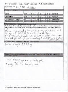
I felt that the showcase for the groups video in front of the class was a good opportunity for the class to give critically positive feedback to the group. I knew that our video chorus definitely needed re filming, which was reflected in the classes' feedback sheets, where people suggested a different costume, more lighting and effects.


However, i was happy that they understood the narrative of the video being a typical pop narrative, which felt the group was successful with because we followed closely to Barthe's "Semantic Code". This code refers to character and characterization which i feel we portrayed our artist well through the events and her actions such as theline up sequence in the video, that we got a good reception for.

Tuesday, 29 March 2011

Filming response:

Having filmed our second verse yesterday, I felt that this went well. We finally managed to get extra actors and took the opportunity to film in the French corridors. Although, i felt that setting up the location took time, as we needed to stick the strips on the wall and set the camera in different positions before starting the filming. However, i felt that we captured a variety of some good shots to use for the video. Nonetheless, i feel now that we could of done a few more shots with the singer and a shot of all the guys, such as a tracking shot, to allow continuity throughout the video.

Friday, 11 March 2011

Filming:

The group has just completed filming the beginning section of the narrative part of the music video. We successfully found an extra person to be our "Guy" so we were able to film the beginning narrative of the song which we had difficulty with before, as the actor was previously unavailable.

I found that this session of filming was very successfully as we were quick with getting the props such as cables and cameras which i felt with the last time of filming took up the most of our filming time trying to find the props needed.

We captured all of the shots that we needed with the "Guy" such as the close up shots of his face, the singer shouting at him, being able to zoom into his face in order to allow editing to be easier for us in the future. I made sure that we shot an array of different angles of the same section to make sure that when we came to editing, we would not have the problem of not having enough shots.

I am about to start uploading the recent footage onto the program "Final Cut" to make sure that our editing is kept up to date.

Thursday, 3 March 2011

Update editing:

Today, i continued on editing our footage on the computer. Today, I implemented quick jump cuts into the beginning of the video where the artist is walking down the stairs. I felt that we needed to have quick cuts in order to compliment the quick beats of the song. Therefore, we now have quick flashes of the artist at the beginning of the song to give a disorientating feel to the video and also a sense of mystery that the audience is unable to take time to have a good look at the artist.

Editing Update:

Yesterday, i edited the footage that we filmed before our half term which was the beginning, the first chorus and the very end of the song. It has given the video some sort of structure and allows us to see what else we need to film to complete the video.

So far, the editing footage is in sync with the song on the program "Photoshop" as i have carefully cut the footage to where we need it. However, it is very difficult at certain times to sync the footage to the song as I had to make sure that it was perfectly in time, such as the bridge of the song had become out of sync with the music which i later resolved.

Friday, 18 February 2011

Response to Photoshoot:

We have just finished our video shoot of the beginning of the video narrative. This lasted from 10:00 am to 12:00 mid day. This was one of the most hectic shoots as we had problems in terms of costumes and equipment. We used a floodlight in order to make the location have natural lighting as the location is fairly dark.


We came across problems such as finding extension leads for our lighting supply. We also had a problem with our costume not being with us on the shoot, therefore, we had to wait until we had it given to us. This therefore, delayed our filming time.


I felt that it was hard to film the sequencing of the shoot because we felt that we could film this section without the use of the actor, who plays the main guy of the video. However, we realized that it was a lot harder to film as he is included for a lot of the filming and he would allow us to see which bits to film with just the artist. Therefore, this is something that we will include next time we shoot this section.

Wednesday, 9 February 2011

Response to filming chorus:

I felt that this was a very long film shoot in terms of equipment needed and the time spent at the location for the filming. However, i feel that we managed to succesfully capture a number of great shots for the chorus of the song with the use of different camera angles such as close ups and low angle shots to all show the importance of the music artist in the chorus.

I feel that instead of just focusing on the artist solely in this section, during our editing of the footage, we could implement jump cuts of other sections of the narrative to make sure that the video stays interesting and quirky

Suitability of main filming location:

This is a rough birds - eye view of the main location that the group is planning to use for the beginning of the video, the majority of the narrative and end of the video. We felt that this was a suitable location because we wanted the area to have a secluded abandoned feel to portray the artist as being mysterious and that it is her "dungeon" where no one is allowed to enter and not allowing the audience to know the proper location. Also, this location has many benefits for our filming as it is big enough to film different angles, but is still a confined space at the same time and there is a door leading outside which links well with ending the video with chucking the guy out.


Monday, 7 February 2011

Filming: Chorus

Yesterday, the group filmed the chorus of the song. We all met up after school with the correct equipment for the shoot. We decided to do it after school because it would allow the hall to be free for us to film as much as we liked. This section of the song is seeing the musicality of the artist, Violet Rowe. Therefore, we have decided to have the artist on a stage with a microphone whilst singing the chorus to give the impression that she is performing to an audience and also toward the camera.

This took place on our main stage in the hall. It give the camera a low angle shot with the use of a hand held camera to give it an authentic feel that I am a part of the audience listening below. I am pretending to be the audience by giving it an amateur footage feel to this section of the video as it is a hand held camera. I feel that the group can edit this section or re film it to improve this part on certain areas such as adding more props later in the future.

Saturday, 5 February 2011

Web page:

This is my final web design page which is going to be "Violet Rowe's" internet fan page. I have made sure that i have followed the conventions found in a typical web page of the pop genre. The colour scheme i have used is purple and black which makes the font and purple colour stand out toward the audience. I have made sure that i have included different forms of advertising, such as awards like the "Brits" and social sites such as "Facebook" and "Twitter". The psychographic of the target audience is specifically linked with their interests being about social sites, magazines and more specifically, the latest news on the artist, Violet Rowe.

I have included the latest album cover of the artist at the top of the web page and the artists lip syncing activity. I found that the positioning of certain aspects of the web page would capture the audience's attention on the most important things, such as the new album cover being released and being advertised on the web page and exclusive images of the artist.

Wednesday, 2 February 2011

Designing back of album cover:

I have also decided to design the back cover of my album cover to complete it. I have made the album a full album instead of an ep album cover, which then allowed me to add other singles onto the album and not just "Kiss N Tell". I feel that I have used the expected conventions of the back of an album cover.

On the back of the album cover, I added the typical conventions of a music album such as the songs, an image, bar code and a side bar of the artist and album name. The image that takes up most of the page are red hearts that I have positioned as a flower. This gives the album cover originality and to reflect the audience being targeted at 14 - 19 year olds as it gives a subtle whilst linking to the typical themes of the pop genre such as love and boys.

The font and colour is also the same as the rest of the album. The font is "Quid Pro Quo" and the colour purple is used as it is the colour theme of the artist which will be used on future merchandise and advertising for the artist.

A problem that I faced was the the colour of the text as it did not show up well on the dark background. Therefore, i was having to modify the colour and effects of the font to make sure that it stood out. In the music industry, this is very important as the audience would not be able to read the text of the album properly, which would result in lack of commercialism as the album would not sell properly.

Tuesday, 1 February 2011

Web page for my artist:

As part of advertising my artist, Violet Rowe, I have decided to also make a web homepage that many current music artists in the music industry have. I will research other artist homepages such as "Kesha", "Ellie Goulding" and "Olly Murs" that are linked to the genre of pop as this is the genre that Violet Rowe's music is.


When researching the different web pages, I will make sure that I use typical conventions of what is expected on a web page and implement these into my own web page to make sure that it is effective. Conventions will be -

- The artists name situated at the very top of the web page

- A menu at the top that crosses the page for easy access of the site

- Advertising music awards and social networking sites

- Previews of the different sections of the site for the audience to be engaged

Sunday, 30 January 2011

Stages of making back of album cover:

In designing the back of my album cover, i have decided to show the different stages and the decisions that i have made during the process of the album leading to the final product. So far, you can see that i have made the start of doing a unique pattern with the use of hearts. I wish to make a design with the hearts such as a large flower to cover the back of the cover.

Stage 1:
I decided to chose a heart for the design as this links to the theme of love which is a typical theme found on pop albums. I felt that this would also show the creativity of the artist whilst also showing the simplicity of the design. Below, i am experimenting with the design by changing the size of the heart and the positioning of text in order to copy conventions of an album cover.

Stage 2:
In the second stage of making the back of the album, i have added more conventions and made more decisions in the design. I have decided to enlarge the hearts in order to fill the large white space and overlap the hearts over one another to make the flower effect. In this stage, i have also made an album name, "The Revolter" which links to the artist and her personality. I have started thinking of different song names for the album.


Stage 3:
This is near the final deign of the back of the album cover. i have finished making the design with the hearts into a flower, taking up most of the white space. Also, i have added colour to the font to make sure that it is colour coordinated. I have also added in a barcode and text with the music company's name to follow conventions. I am still in the process of adding a few more songs to the list. It is also evident that the font is not clear in contrast to the background, so i may have to fiddle with the effects of the text and try and make the colour darker for instance.

Saturday, 29 January 2011

Evaluation on how effective the artwork is:

I feel that my final album cover piece is effective in many ways:

Design:
Firstly, I feel that the simple but unique design I have used successfully targets my target audience. The feminine features of the artist, such as her lips, the large flower and her eyes are highlighted. Through media language, i felt that this would symbolize uniqueness about the artist, reflecting the message that she is a care free person.

This would therefore give the album some differentiation from most other album covers, as it is a unique design, so when it is being sold in shops, it would stand out from amongst the other album covers.

Audience:
I feel that this album cover targets the audience of young girls from 14 - 19 year olds as it allows them to see the artist as a role model as she is fashionable and is being portraying a stereotypical pop artist. This is targeted through her pose and and facial expression which gives gives the portrayal that she is a role model for the young target audience.

Thus, the psychographic of the audience would be mainly surrounded with fashion, magazines, social sites or anything that happens to be popular which many people find popular. Maybe not as significantly, but it will also appeal to young boys of the same age as it they may find the artist attractive with her feminine features being focused on from the cover.

Conventions:
I also feel that this album cover follows all of the typical conventions for most album covers. The main image is focused on the artist, which is typical of a pop album, with her posing in a trendy and stylish way toward the camera. The font is energetic and makes the album cover stand out with the bright colour juxtaposing the faded image colour.

I have also included the album name and artist name on the front cover. From the back of the album cover, i have enlisted all the different songs that are to be included in the album and i have included a spine of the album cover that contains the name of the album and the artists name as expected with any real album cover.

Reflection on process of making artwork:

I am currently still piecing together my final album cover idea. I feel that out of my other ideas, this is the most effective as it conveys the pop genre well.

Whilst creating this album cover, I found that the program "Photoshop" had its difficulties at times. I have found it hard to work my way around and to understand how to use it effectively such as making the two layers for the colour/black and white effect of the image of the artist. Apart from that, I have found it interesting and fulfilling in being able to create a good album cover.

However, i did not expect that making an album cover would not take so much time and effort. It has taken me lots of time to take the images, to find suitable locations, to portray the right pose from the artist to making the final piece on Photoshop whilst trying to make a unique style for the cover.