Thursday, 5 May 2011
Wednesday, 13 April 2011
Tuesday, 5 April 2011
Major Editing:
Monday, 4 April 2011
Response to filming on Friday 1st
Thursday, 31 March 2011
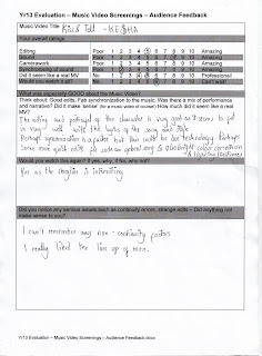
Showcase Response:
Tuesday, 29 March 2011
Filming response:
Friday, 11 March 2011
Filming:
I found that this session of filming was very successfully as we were quick with getting the props such as cables and cameras which i felt with the last time of filming took up the most of our filming time trying to find the props needed.
We captured all of the shots that we needed with the "Guy" such as the close up shots of his face, the singer shouting at him, being able to zoom into his face in order to allow editing to be easier for us in the future. I made sure that we shot an array of different angles of the same section to make sure that when we came to editing, we would not have the problem of not having enough shots.
I am about to start uploading the recent footage onto the program "Final Cut" to make sure that our editing is kept up to date.
Thursday, 3 March 2011
Update editing:
Editing Update:
Friday, 18 February 2011
Response to Photoshoot:
We have just finished our video shoot of the beginning of the video narrative. This lasted from 10:00 am to 12:00 mid day. This was one of the most hectic shoots as we had problems in terms of costumes and equipment. We used a floodlight in order to make the location have natural lighting as the location is fairly dark.
We came across problems such as finding extension leads for our lighting supply. We also had a problem with our costume not being with us on the shoot, therefore, we had to wait until we had it given to us. This therefore, delayed our filming time.
I felt that it was hard to film the sequencing of the shoot because we felt that we could film this section without the use of the actor, who plays the main guy of the video. However, we realized that it was a lot harder to film as he is included for a lot of the filming and he would allow us to see which bits to film with just the artist. Therefore, this is something that we will include next time we shoot this section.
Wednesday, 9 February 2011
Response to filming chorus:
I feel that instead of just focusing on the artist solely in this section, during our editing of the footage, we could implement jump cuts of other sections of the narrative to make sure that the video stays interesting and quirky
Suitability of main filming location:


Monday, 7 February 2011
Filming: Chorus
Saturday, 5 February 2011
Web page:


Wednesday, 2 February 2011
Designing back of album cover:

Tuesday, 1 February 2011
Web page for my artist:


- A menu at the top that crosses the page for easy access of the site
- Advertising music awards and social networking sites
- Previews of the different sections of the site for the audience to be engaged
Sunday, 30 January 2011
Stages of making back of album cover:


Saturday, 29 January 2011
Evaluation on how effective the artwork is:
Reflection on process of making artwork:
Friday, 28 January 2011
Picking the suitable album cover idea:

Preliminary album cover ideas:
 Idea 2:

Thursday, 27 January 2011
Artwork choices made:

Choices made during the artwork construction:


Wednesday, 26 January 2011
Change in idea:
Font suggestions for album artwork:


 Billy Argel font: